Case file № 005 · Data product · Evidence store
When to be where
- System
- Monsoon.fyi
- Client
- Product build
- Live
- monsoon.fyi ↗
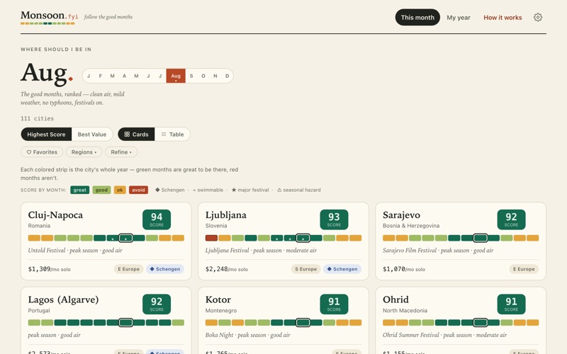
Nomad List tells slow travelers where to go. Monsoon tells them when. It scores 111 cities, month by month, across weather, air, safety, season, events, and cost, with a year-planner that keeps a Schengen 90/180 count as you build. Underneath is an evidence store where every dollar has a source, a date, and a confidence.
 Live
LiveThe evidence
Screens of the running thing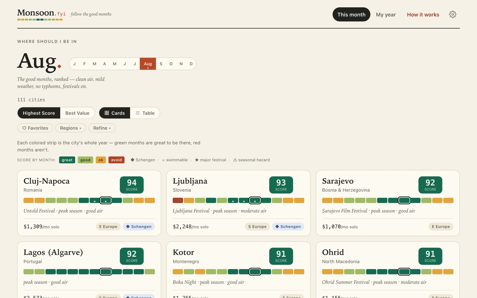
The system
How the parts connectIn
Evidence files cost · safety · advisories · season · events
111 cities twelve months each
The system
Scoring model versioned · weighted · re-weightable
Baked dataset source · date · confidence on every figure
Out
Month strips a year at a glance
Year planner live Schengen 90/180 meter · auto-plan
Before & after
The account, both columnsBefore
- Slow travelers plan a year of one-to-three-month stays by cross-referencing climate tables, visa rules, cost-of-living sites, and vibes.
- The cost sites are crowd-sourced and undated. The crime statistics are not comparable across countries. The Schengen 90/180 rule turns a pleasant plan into a compliance problem.
After
- Every city gets a 12-cell month strip. One glance answers “is March good here?” A ranked “this month” view, deep per-city sheets, and an editable year-builder with a live Schengen meter and shareable URLs.
- The scoring is written down, versioned, and re-weightable. Three lenses (top pick, livability, high season) re-weight the same stored components, and a safety floor drags a score down rather than letting cheap and dangerous win on value.
- Cost is not scraped from a crowd. Each city has eight itemized components, and each component carries its dollar figure, its source, the date it was true, and a confidence grade: 888 figures, and the crowd-sourced site everyone else uses was removed from the data on purpose.
- Safety is anchored to a comparable statistic (national homicide rates from the World Bank, with WHO estimates substituted where the World Bank data is stale) rather than to survey vibes. Government travel advisories are shown as badges and never silently cap a score; where the model and a government disagree, a flag says so.
- An auto-planner searches the year for the best two-to-four-month stays under your filters, penalizing long hops and pruning anything that breaks the 90/180 rule. City identifiers are frozen in an append-only table with a check in the build, so a shared plan never points at the wrong city later.
The verdict
A full product, shipped end to end: data model, scoring methodology, brand system, and UI. The part I would show an auditor is the evidence store. Every number has a provenance, and the places where the data is estimated rather than sourced are marked as such.
Bill of materials
What was used, and the job it did| 01 | Svelte + Vite | the application; no backend |
|---|---|---|
| 02 | Python bake pipeline | twenty scripts that precompute every score |
| 03 | Evidence store | 111 cost files · World Bank · WHO · FCDO · State Dept |
| 04 | Custom design system | a field atlas, not a dashboard |